At the end of the day it remains a business!?!
The simple truism seems to be so often over looked in the world of professional photography - by all parties. Speak to anyone who earns their living through photographs and they will be able to recount countless stories of people wanting images for nothing or simply screen scraping them for their own personal use. But those same photographers do not always view their own business through truly business eyes and very often they have value, usually in their back catalogues / libraries, that used correctly, can leverage real value.
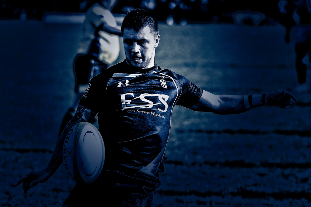
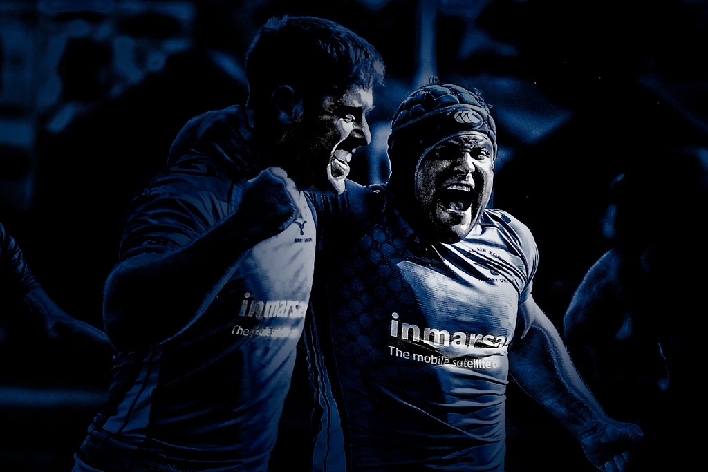
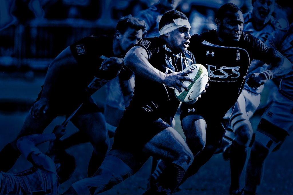
The images on this blog are from an exercise undertaken to highlight to a client how stylisation (fashions if you wish because they do date) of images can give a different feel and convey a different message, often unwritten.
Highlighting what matters.
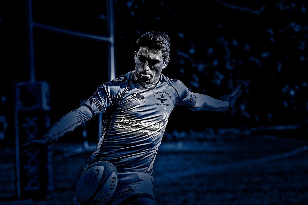
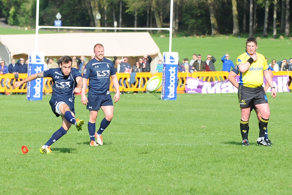
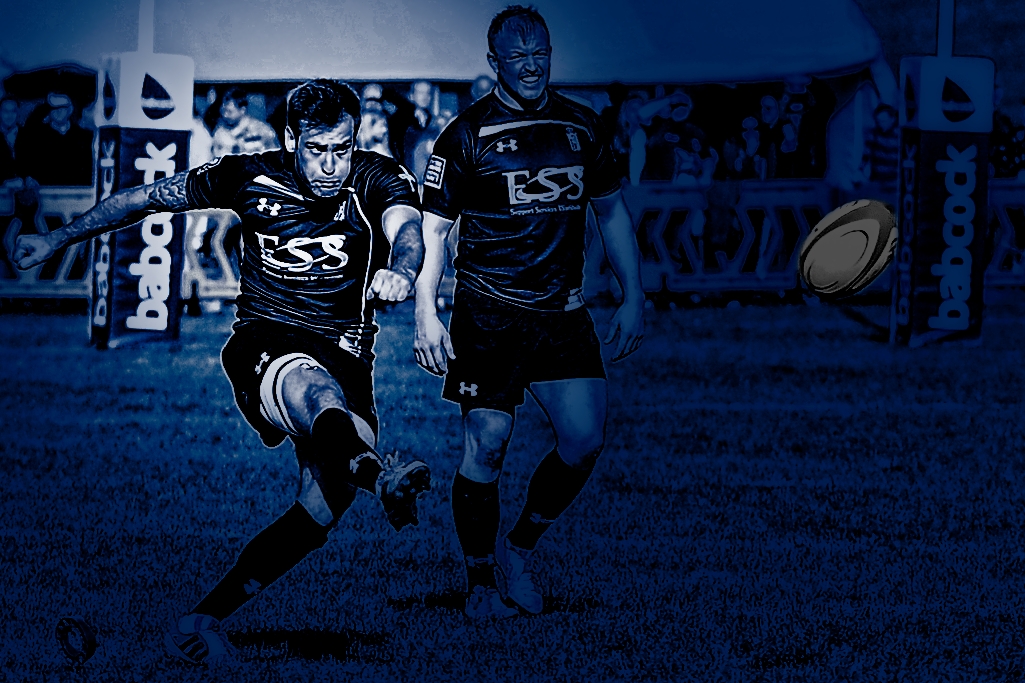
The starting point was 20 images from last year's RAF v RN match at RAF Halton. A venue where the back ground to many of the images is often cluttered and unsightly. The aim to promote brand awareness through unwritten communication whilst still creating images that were true to the ideals of the photographer. [In this case Lee Crabb of Scrumpix Images]. A template was created using processes that would have been as familiar with those who worked with film processing as those who know only a digital work flow. Through creating light and dark areas the eye is led through the image, whilst the use of contrast, cross processing and bleach processing is used to reduce the impact of the back ground, create a reproducible style and in this case highlight the sponsors logos. The template was designed for the navy blue shirts of the RN team but I have also included a couple of RAF shots to show that though the template works its impact is reduced and better results would be attained by designing a template that suit the more challenging requirements of white on their sky blue shirts. Something for another day?
........and the final image!
True to the aims we look to capture for action images the effort that Jon Humphrey is putting into the kick has been accentuated whilst the white logos on his shirt have been made to 'pop' that little more. A good action shot but also one that appeals to marketing departments if used in the right context.

Leave a Reply